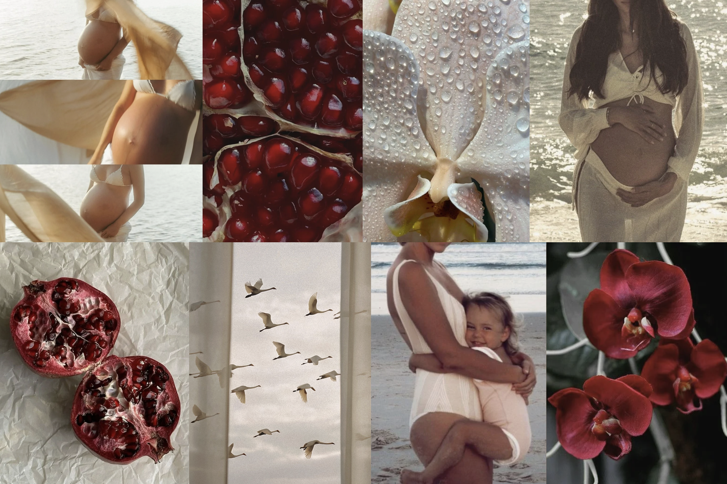
Sana is a fertility coaching brand rooted in the belief that conception begins with trust in the body’s innate intelligence. It exists as a gentle counterpoint to the hyper medicalized narrative around fertility, guiding women and couples toward conception that feels natural and intentional. The brand needed to reflect this philosophy, offering an identity that feels warm, sacred and deeply human.

The goal was to create a visual world that honours the cycles of life, evokes emotional safety, and embodies the quiet wisdom at the heart of Sana’s mission. The identity had to feel nurturing and reassuring while remaining elevated enough to stand as a holistic alternative to clinical fertility spaces. The name was picked out as short for Aksana, the consultant behind the brand.
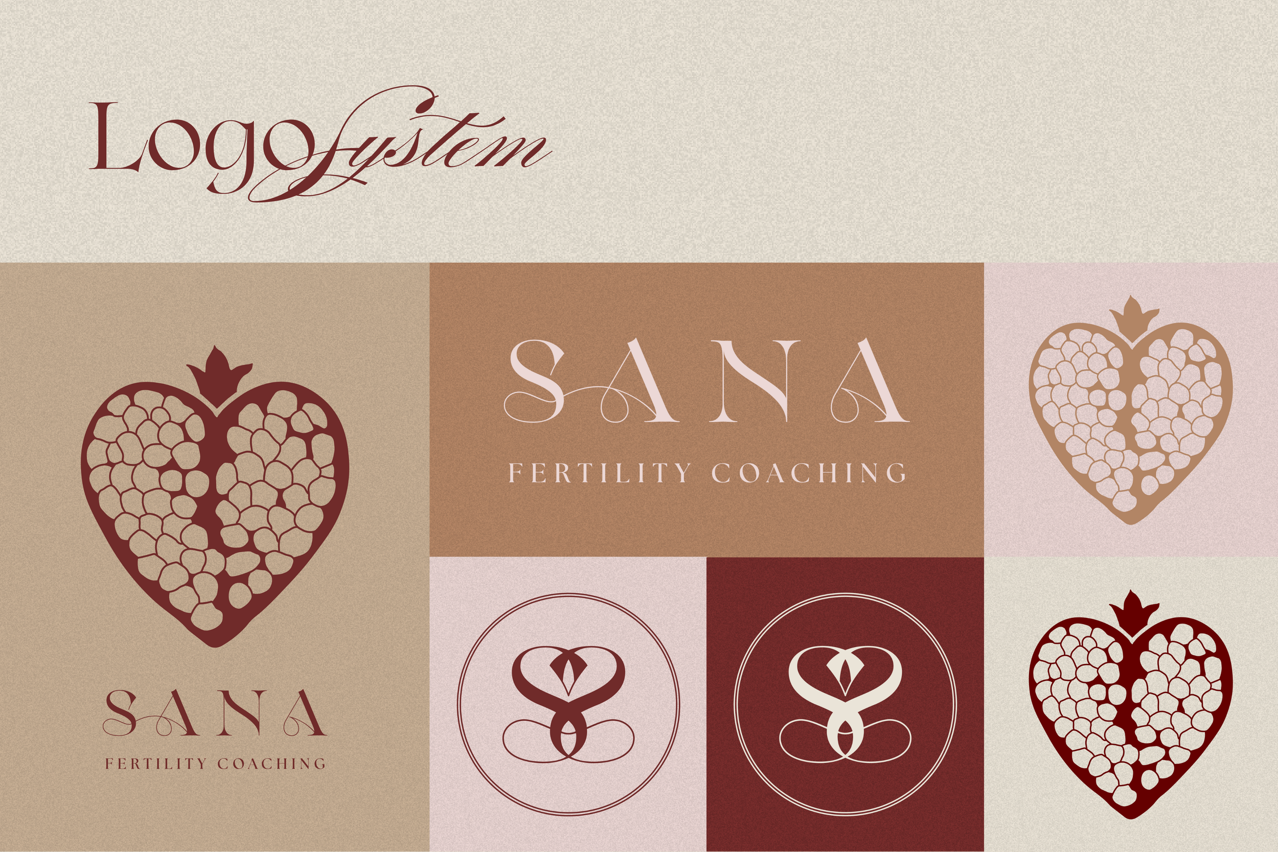
Logo & Visual Elements
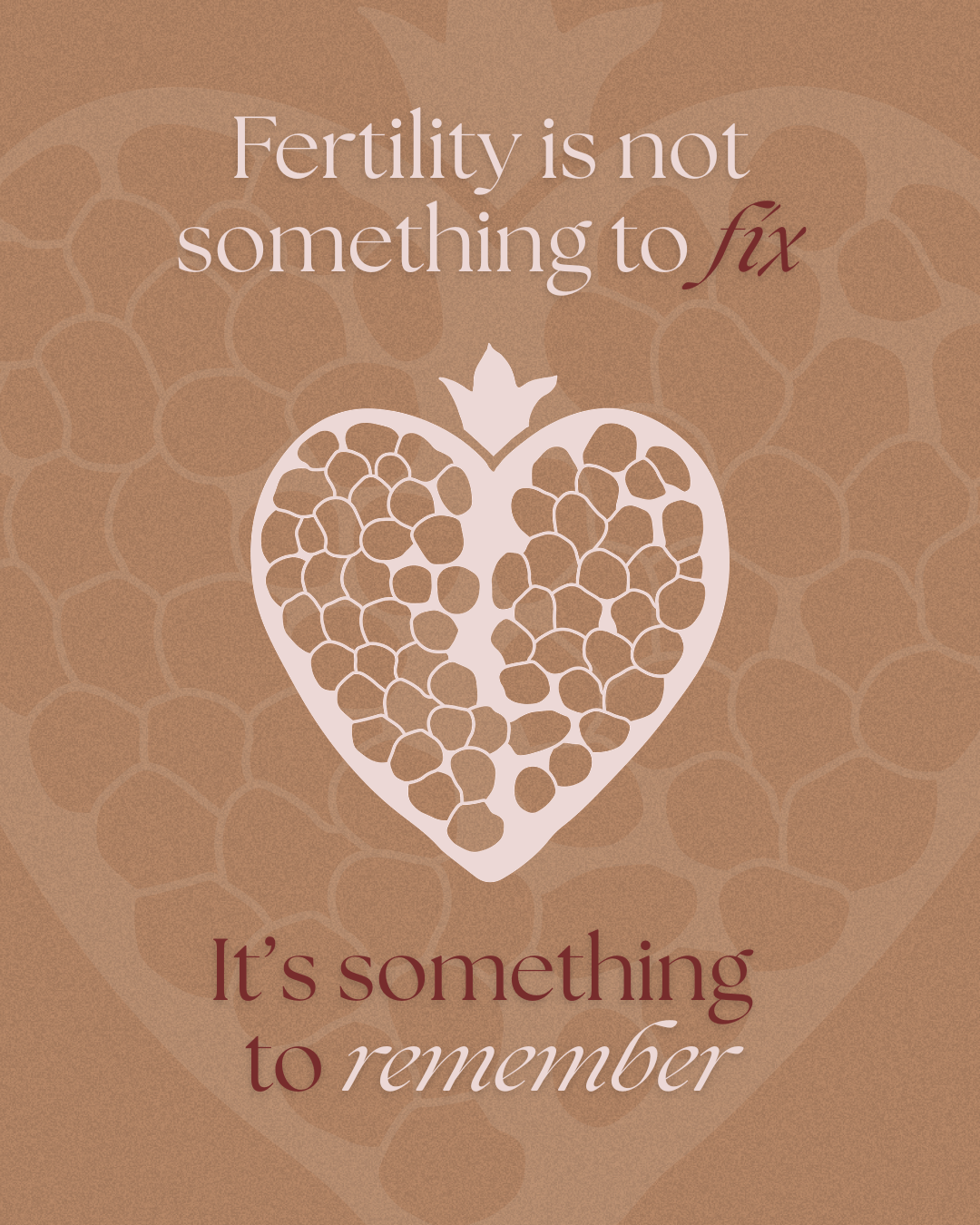
The Sana logo system draws from one of the oldest symbols of fertility and feminine power, the pomegranate. The primary mark features a heart shaped pomegranate filled with seeds, each seed representing possibility, potential and new life held within a vessel of love and protection. The crown at the top creates a subtle echo of the Sacred Heart, adding a layer of symbolism connected to devotion, warmth, and the sacredness of the conception journey.
Alongside the main symbol, a set of additional marks completes the system: a refined wordmark, a standalone icon of the heart pomegranate and a monogram composed of mirrored S forms. The monogram’s curves suggest both a heart and the soft silhouette of an orchidea or a womb, an abstract nod to the female reproductive system and the tender space where life begins.
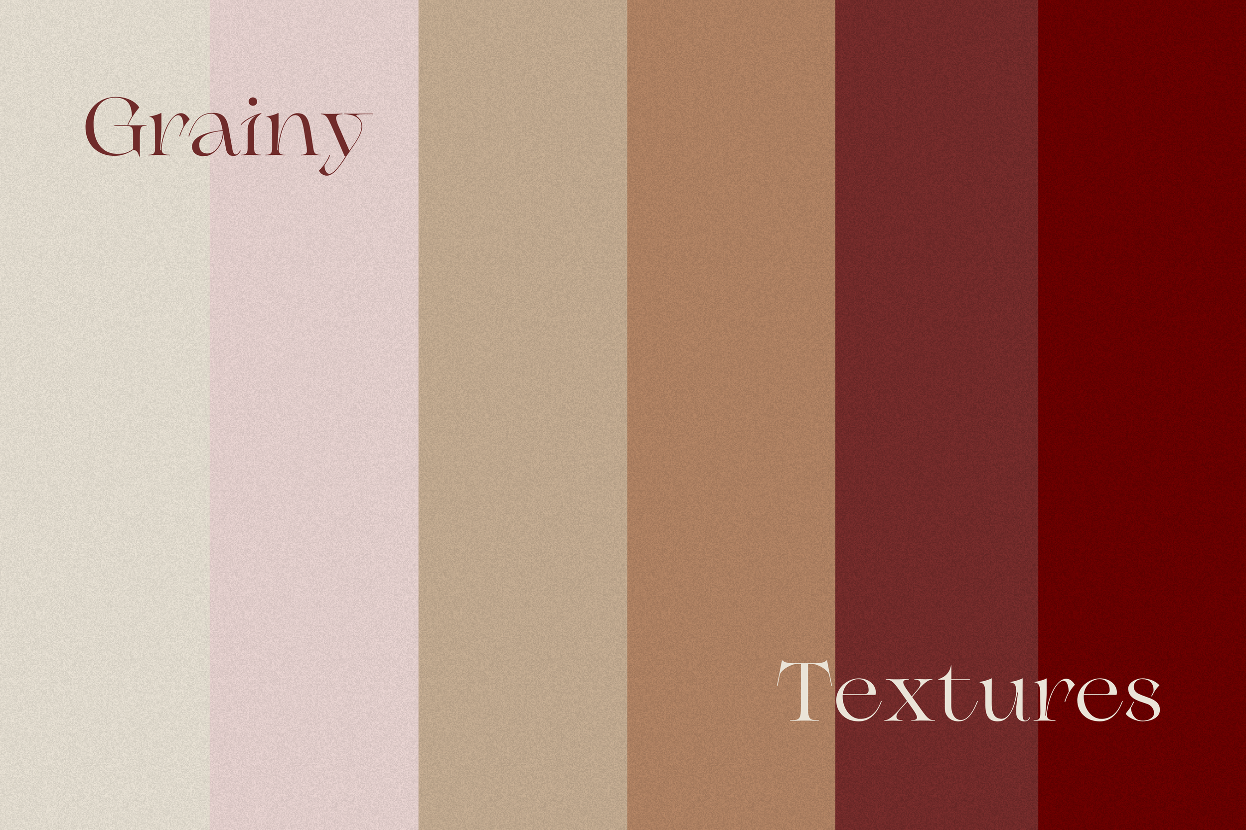
To support the identity, a set of grainy textured backgrounds was created using the brand palette. These subtle textures add warmth and tactility to the visual system, ensuring the brand feels lived in, grounded and real rather than sterile or clinical.
Typography & Palette
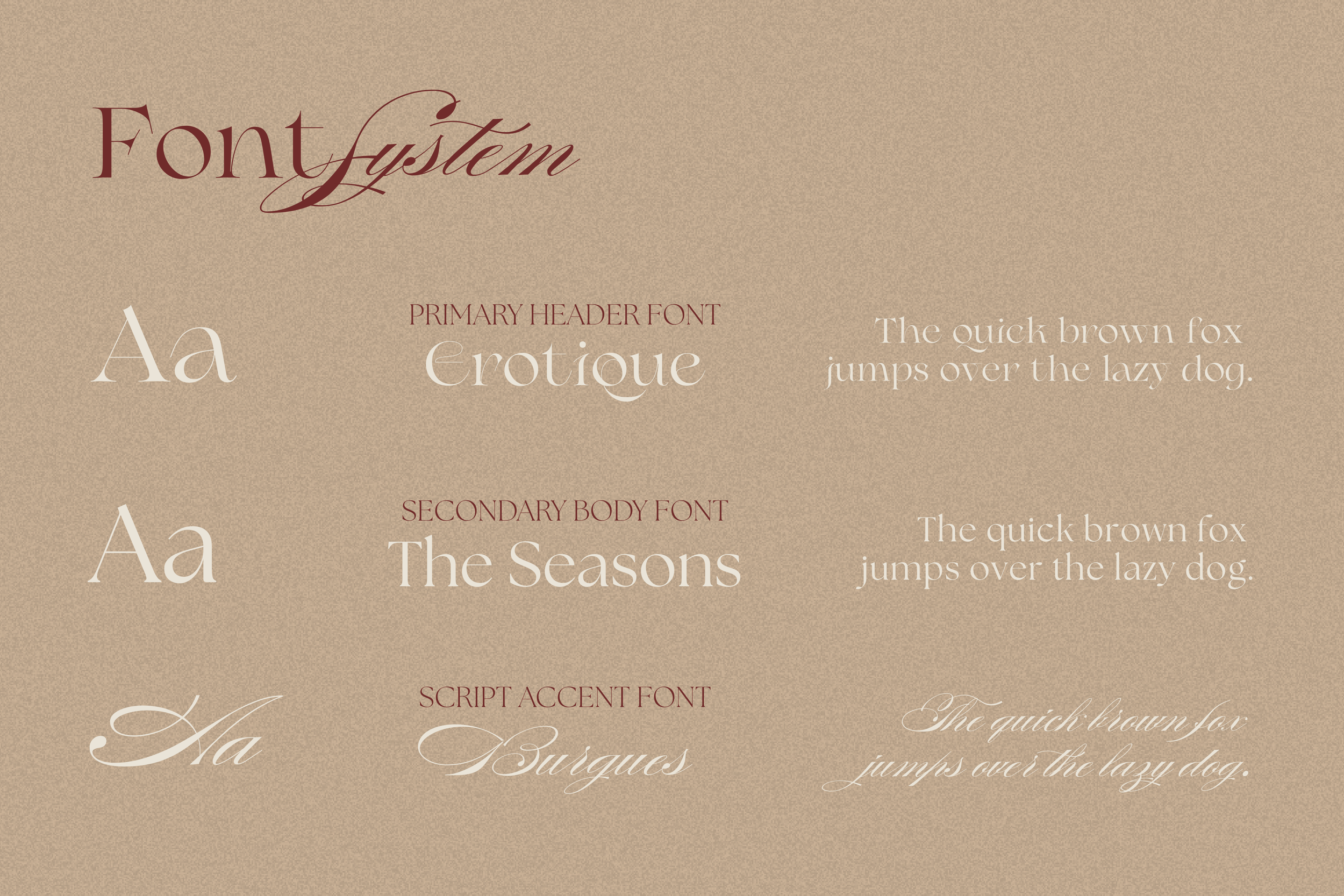
Sana’s type system brings together the elegance of Erotique for headlines with the softness and clarity of The Seasons for body text. Burgues, used sparingly, adds a delicate handwritten touch for accent moments. Together, the typefaces express the balance of wisdom and warmth that defines Sana’s approach: feminine but strong, poetic but practical.

The palette centers on reds, pinks, and warm neutrals, drawing inspiration from the pomegranate, human skin tones, and natural light. Each color contributes to the brand’s emotional landscape:
The colour palette draws from earth and age-old tones:
⟡ MAROON: life force, grounding, depth
⟡ PERSIAN PLUM: intimacy and inner wisdom
⟡ LIGHT TAUPE: earthiness and stability
⟡ KHAKI: calm and balance
⟡ LINEN: softness and reassurance
⟡ ALABASTER: purity, light, and clarity
The result is a palette that feels warm, nourishing, and safe, mirroring Sana’s role as a supportive guide through the fertility journey.
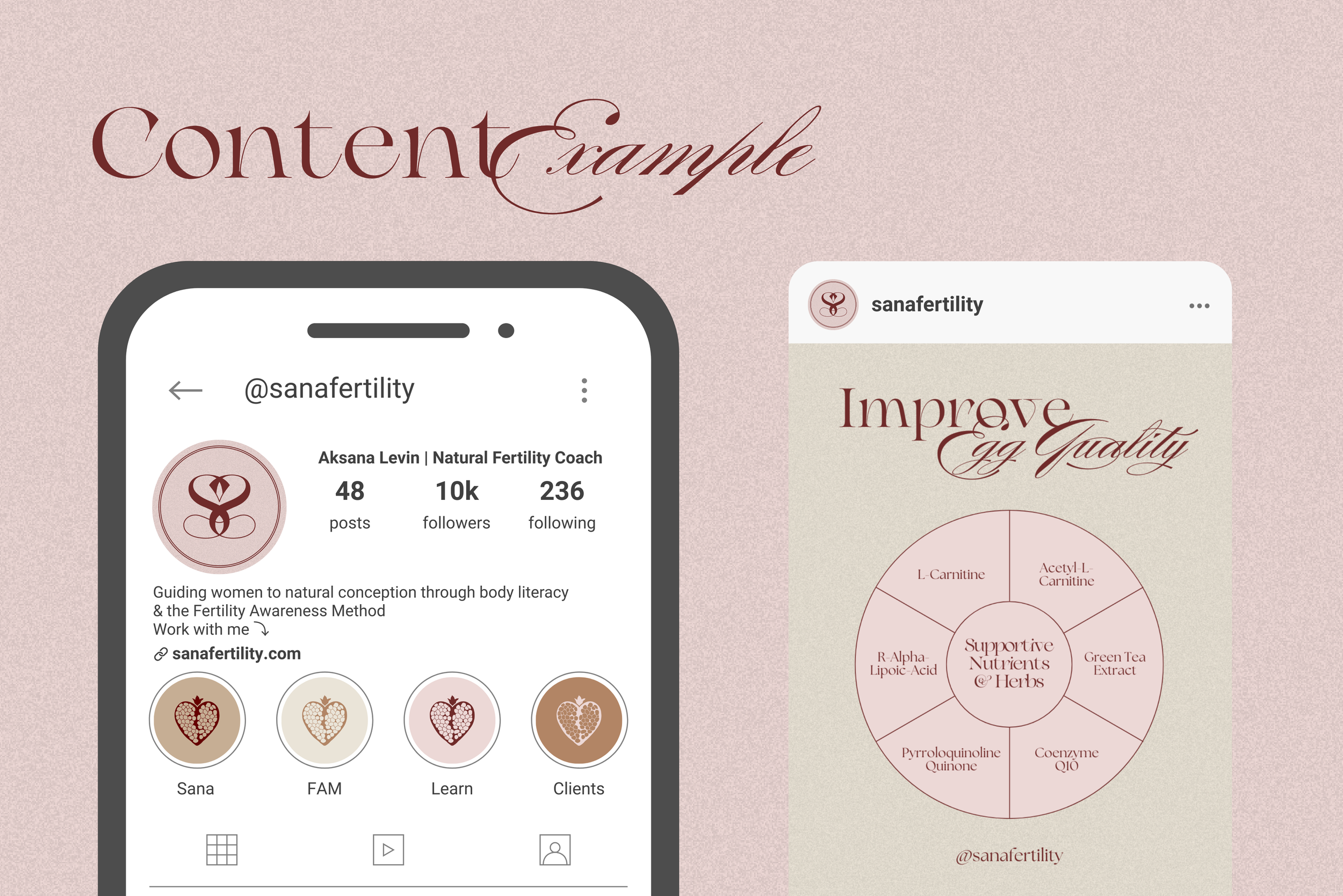
Website & Instagram
A multi page website was created to serve as both an educational resource and an inviting space for new clients. The site includes a Home page, a full About section, a Services page, a comprehensive Body Literacy educational section and a Contact page. The visual design uses the brand’s palette, typography, and textures to create an experience that feels calm, trustworthy and deeply human.
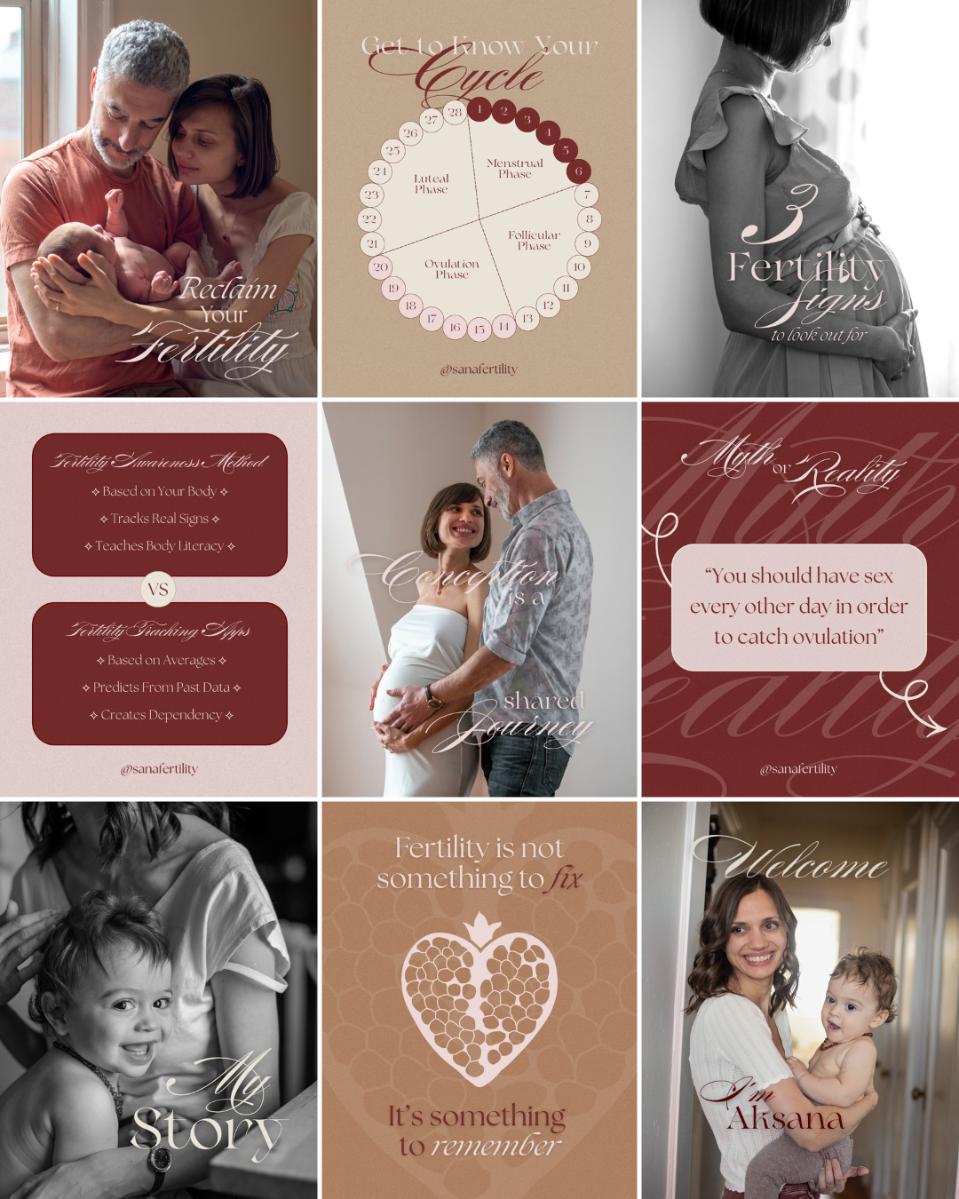
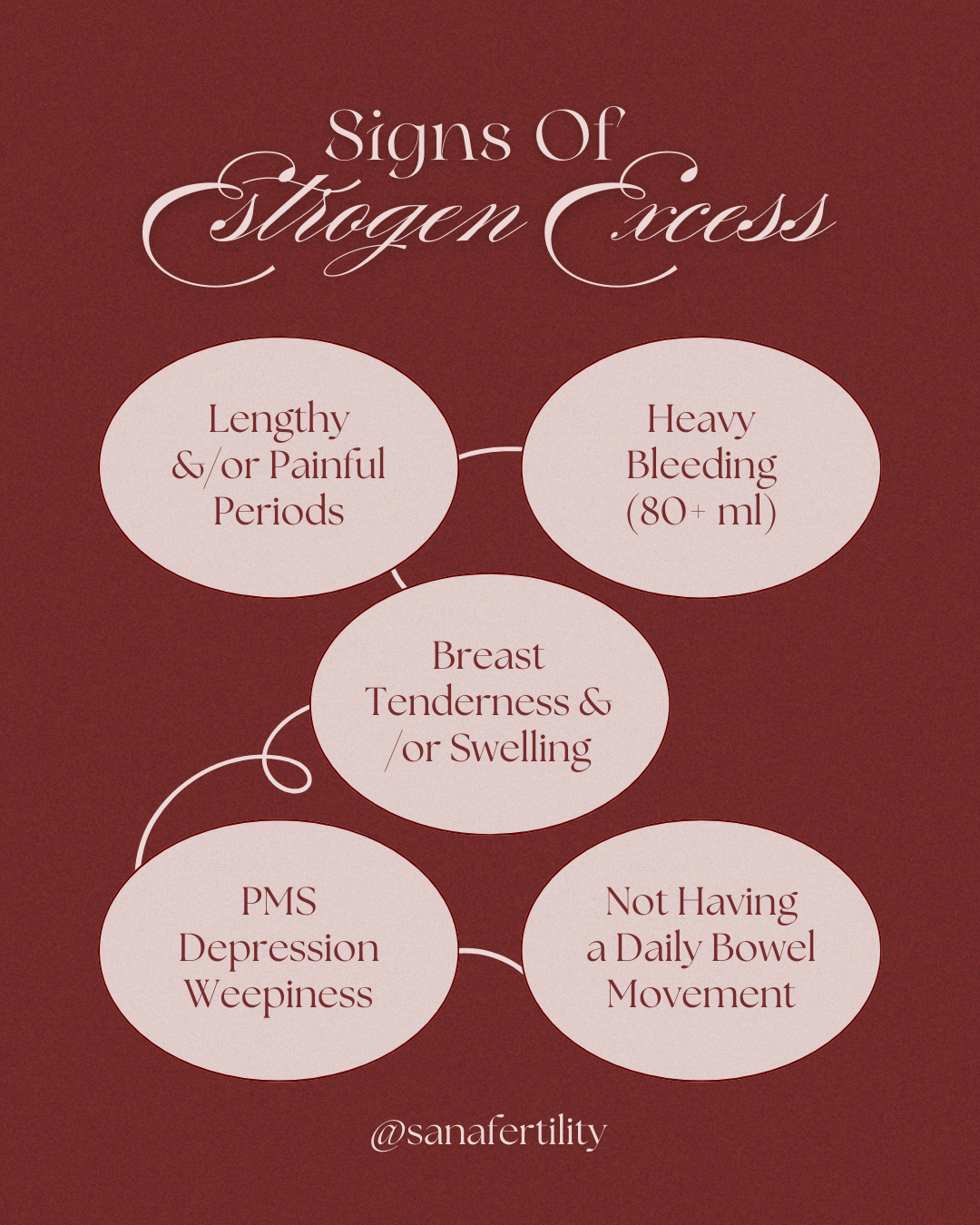
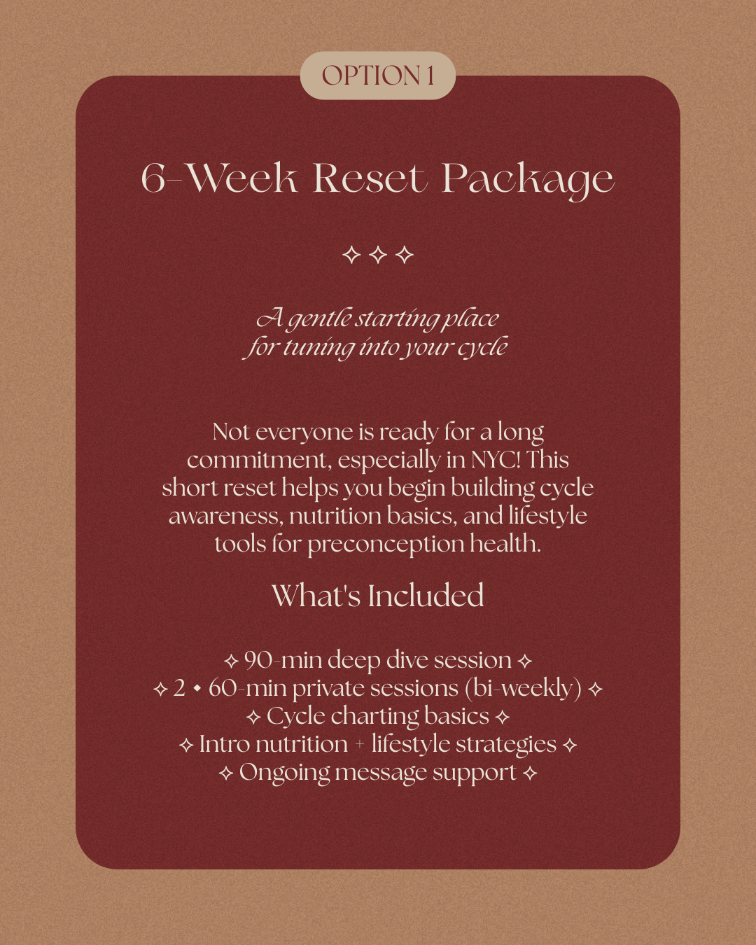
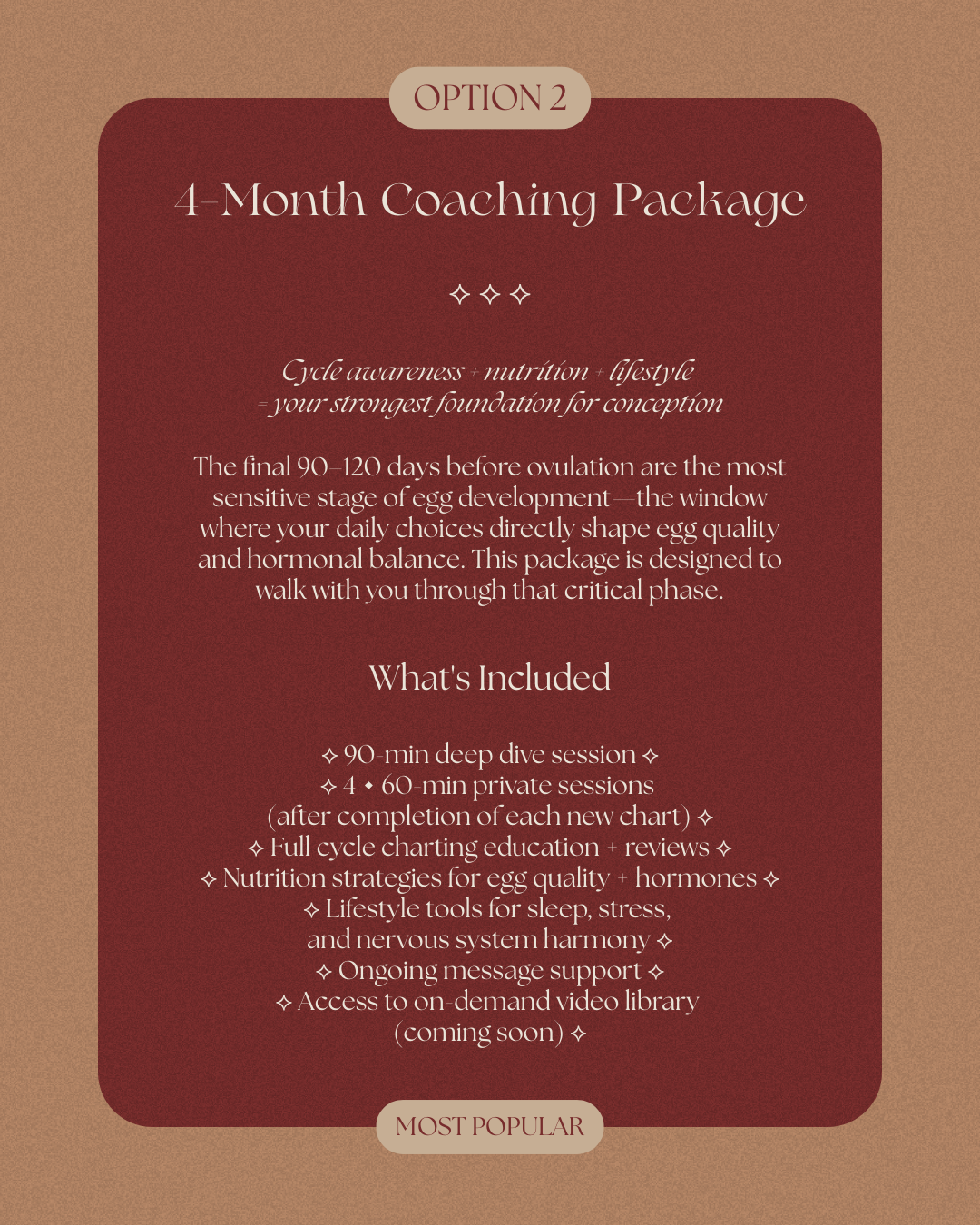
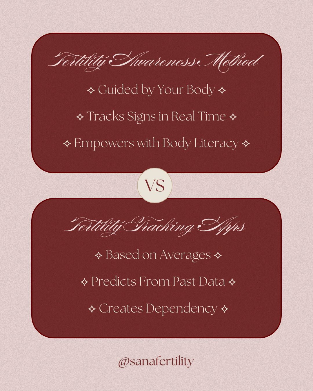
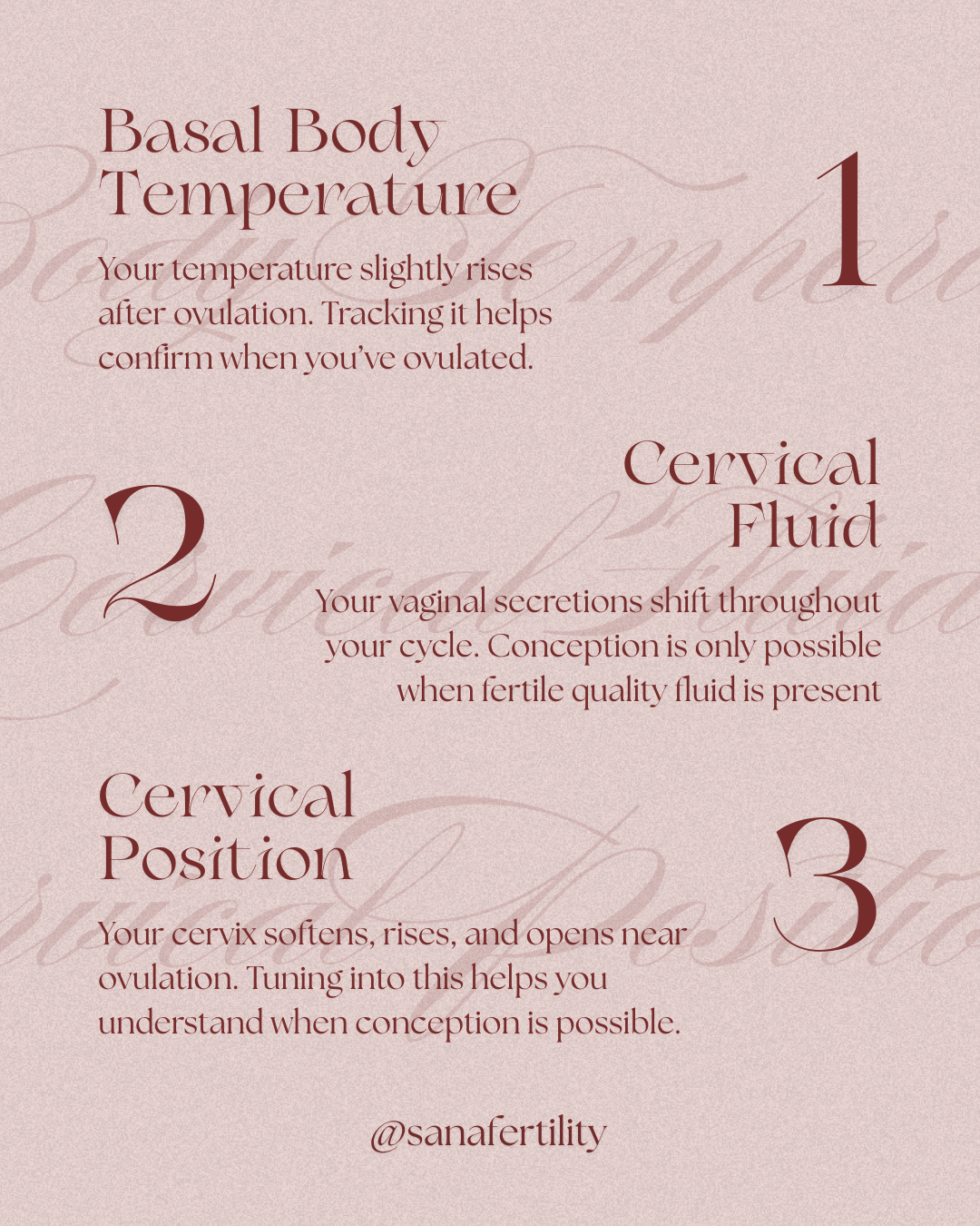
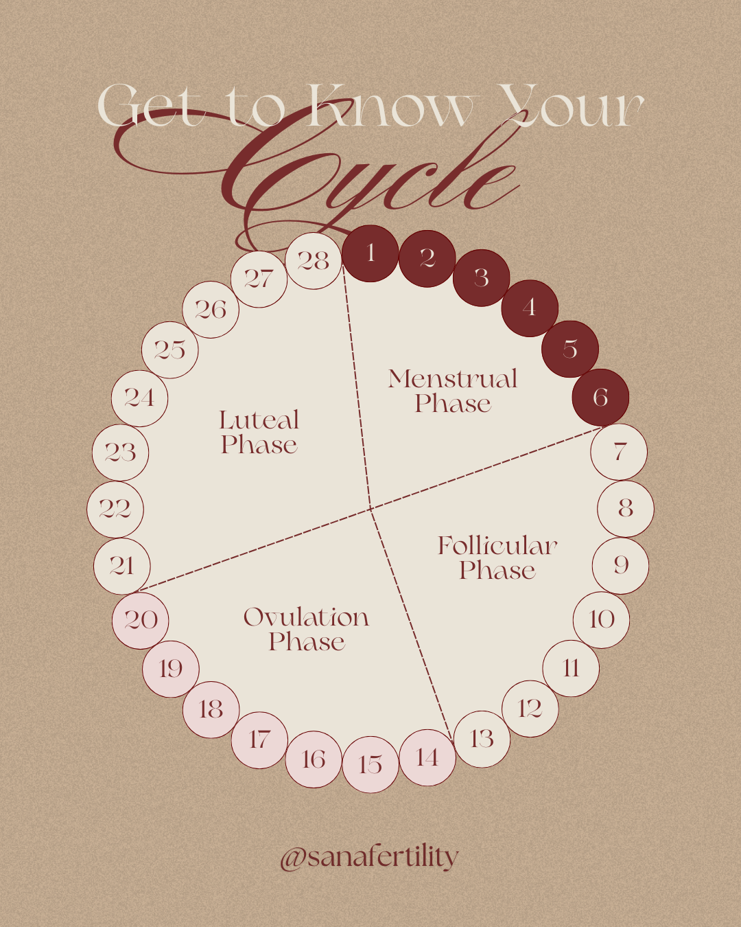
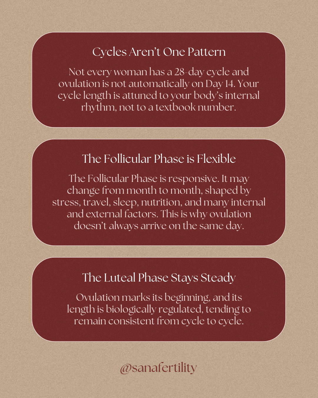
To establish Sana’s online presence, nine Instagram posts were developed, introducing the brand, its philosophy, and foundational concepts like fertility awareness. The posts form a cohesive, warm grid designed to gently educate while embodying Sana’s nurturing tone.